Changed Some Site Fonts Again, Better Make a Blog Post
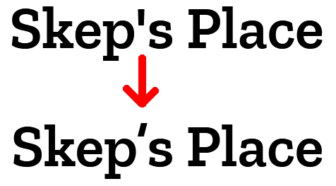
If you are a frequenter of Skep’s Place, you may have noticed some visual changes put in place the other day. Namely, I have replaced the typeface for most of the text on the site. I wouldn’t consider this particularly noteworthy at face value, but there was truthfully a lot of consideration that went in to mixing up my CSS file, and I felt that some folks might enjoy the journey that I took.
As tends to be the norm with me, the big change was the end result of something remarkably trivial. In this case, the impetus was something called “curly quotes”. Many of you reading will already understand what I’m talking about, but if you do not, this example should help illustrate what I mean. Pay attention to the quotation marks:
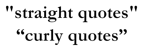
You’ll see that the quotation marks on the bottom “curl” around their contained text, and the set on the left is distinct from the set on the right. The quotes on the top are the same on each side; they are a one-size-fits-all solution, and do not look as elegant.
(As a quick aside, what I am about to say regarding quotation marks also applies to single quotes and apostrophes.)
By default, the quotation mark key on your keyboard types a straight quote. As with many keyboard design decisions, this was largely a compromise to fit typewriters, when keyboard space was at a premium and you had to make do with less. Heck, I learned the other day that the oldest typewriters didn’t have the numbers 1 and 0; you were expected to type a capital I or O in their place. Or to type a dollar sign ($), the intended method was to type a capital S, then backspace and type a capital I over top of it. This seems absolutely barbaric now.
However, curly quotes have been the norm in the publishing industry for a long, long time, and it’s no wonder. If you randomly bump into one half of a curly quote in the middle of a paragraph, you instinctively know which direction you can find its partner in. On top of that, the more strictly-defined nature of curly quotes gives typographers more room for creativity and embellishment when designing them for a typeface.
But when it comes to modern computer and keyboard use, the straight quote wins out due to being a general-purpose punctuation. Writing doesn’t require curly quotes, while straight quotes have programming applications and can double as “prime symbols” for shorthand notation in places like foot/inch measurements or minute/second designations in latitudinal/longitudinal coordinates. It’s the duty of the software to make up for this; Microsoft Word is probably the best-known example of an application that will automatically convert straight quotes to curly quotes as you type to give your document a more polished look.
Now, I was perfectly aware of all this when I started Skep’s Place a couple years back, but at that time, I made the conscious decision to only use straight quotes on the site. Two major factors to this: one, I did a lot of my writing right in the code editor, which was not inserting curly quotes; two, I seemed to recall that curly quotes didn’t always play nice with web character encoding and would sometimes just not display (although this was probably a more prevalent issue in the web’s early days and appears to be a solved problem now).
Cut to a few years later, though, and I’m walking back that decision. I’m doing this on the grounds that the use of curly quotes in writing is more “correct” in a pedantic and self-congratulatory sort of way, and if there’s one thing I like, it’s being pedantic and self-congratulatory (plus it makes adding quotes to alt text a lot easier). I’m not really planning on converting all of my existing content—much of which I would have to do by hand—but going forward, I’m going to be making a concerted effort to make curly quotes the norm.
Which finally brings me around to my site fonts. Because when I started using curly quotes, I noticed that the style employed by my former typeface, Zilla Slab, was… underwhelming, in that it appeared to use the same character for both sides of the quote. Kind of defeats the purpose.
I was also never 100% happy with the readability of Zilla Slab. Now, I love the chunkiness of a slab-serif font, but when you have paragraphs upon paragraphs of text—as makes up most of my site—it might be a little on the busy side. There was a part of me that wanted to pull in a sans-serif font for the bulk of the page text, and was actually something I experimented with a couple months ago before giving up on the endeavor.
See, my problem back then was that I wanted to keep Zilla Slab as a highlight font. Headers for sure; but I also wanted it to be used for link text, and maybe even bolded text too. Something to really make these elements stand out… except I couldn’t seem to find a font that played well with Zilla Slab. Clashing, clashing, always clashing.
I started again this time with the same line of thinking, and naturally, achieved the same result. When I finally gave in, stopped using Zilla Slab for the bold/link text, and just let the sans-serif font (a typeface called Outfit) speak for itself… it actually seemed to work. The clashing was nearly gone.
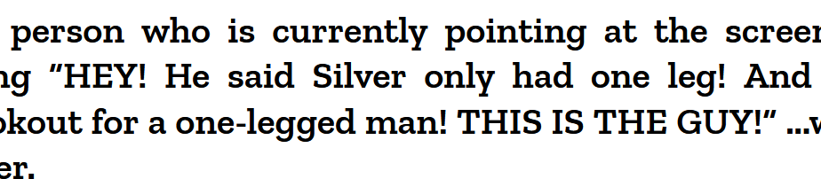
I say “nearly” because I wasn’t quite there. Here is what my Treasure Island index looked like at this point:

It wasn’t bad, but I still didn’t think the two fonts were complimenting each other like I’d hoped. I experimented on the h2 tag, trying all sorts of ways to give it a “glow-up”. Borders, background colors, drop shadow. Nothing that vibed with the otherwise fairly minimalistic design.
The solution I hit upon was twofold: make the headers larger and bolder. The end result is currently live. Treasure Island page for comparison.
I realized what was happening was that both fonts were competing for attention. Even though it was smaller, Outfit’s sleeker, more graceful design was pulling the eye away from Zilla Slab, which should have been the primary focus due to its status as a header.
So, I made Zilla Slab speak a little louder. With its newfound confidence and general rarity, it now commands attention on the page whenever it appears, and Outfit easily falls in line behind it. At last, harmony. I’m pretty pleased with this; I think my site still kept a lot of the same subtly-quirky character it had, but for actually reading the darn thing (which you are doing right now, and thank you for that), the text is now a lot cleaner and less dense, and hopefully easier on the eyes.
And, yes, I fixed the apostrophe on the logo, too.